MVP validation and build
Lead Designer
Etch Group
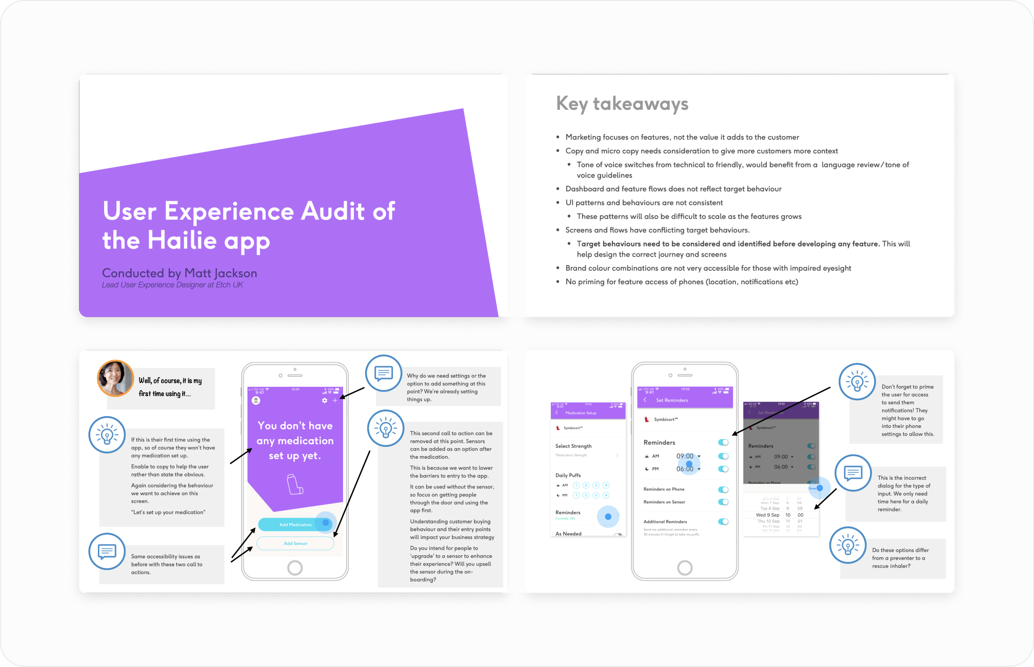
Hailie had proven its smart inhaler technology in clinical trials, but moving into the U.S. consumer market meant facing a new challenge: how do you help people actually use it in their daily lives?
We knew that even the most innovative tech would fail if the experience wasn’t simple, welcoming, and motivating. For people managing asthma or COPD, every extra hurdle can mean frustration and eventually, disengagement.
That’s where onboarding became critical. A strong first experience could turn “just another health app” into a trusted companion.
I worked with Hailie’s team to run interviews and surveys with people living with asthma and COPD. What stood out: people didn’t just want reminders — they wanted to feel like they were in control. Many said the first few days with a health product usually decided whether they’d stick with it.
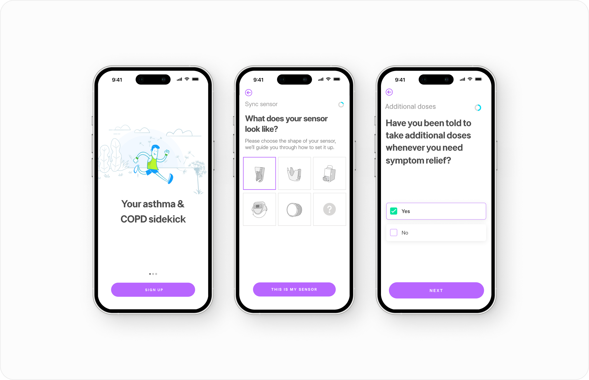
Instead of dropping new users straight into setup screens, I designed a guided first-run experience that:
We paired onboarding with simple, contextual nudges — like reminders tailored to weather or activity — that helped people feel supported without nagged.
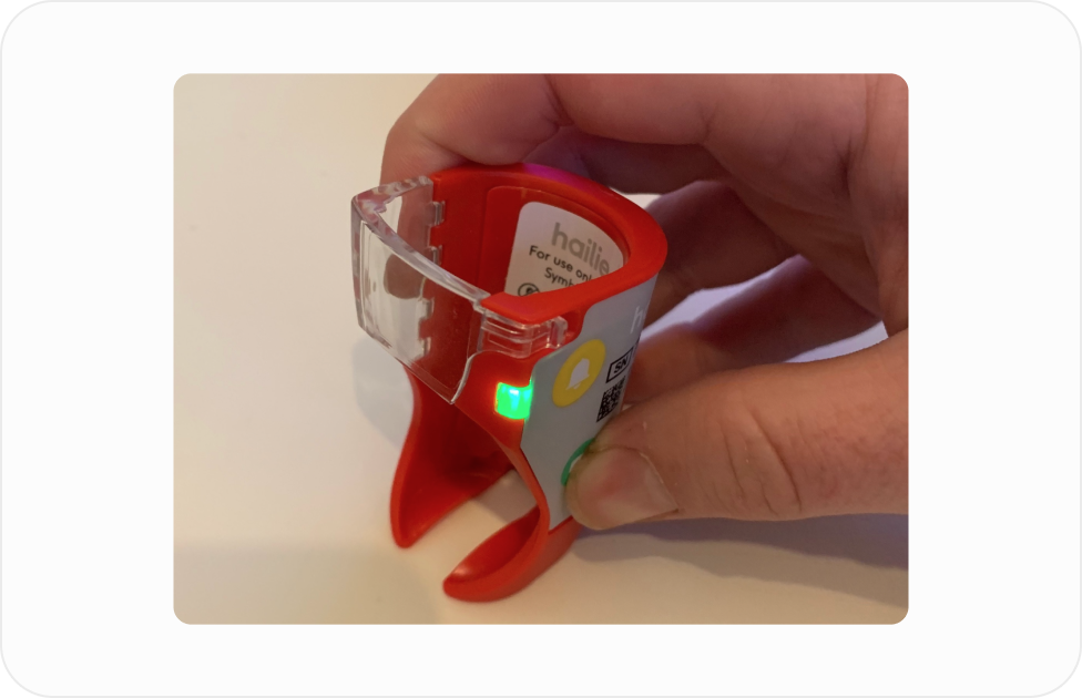
Testing the inhaler
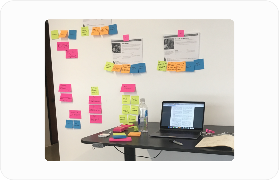
Personas and building the prototype

This shift in focus from “get people into the app” to “set people up for success” gave Hailie a much stronger foundation for engagement.
By grounding onboarding in empathy and real user goals, we turned the first touchpoint into a moment of trust — one that encouraged people to keep coming back.
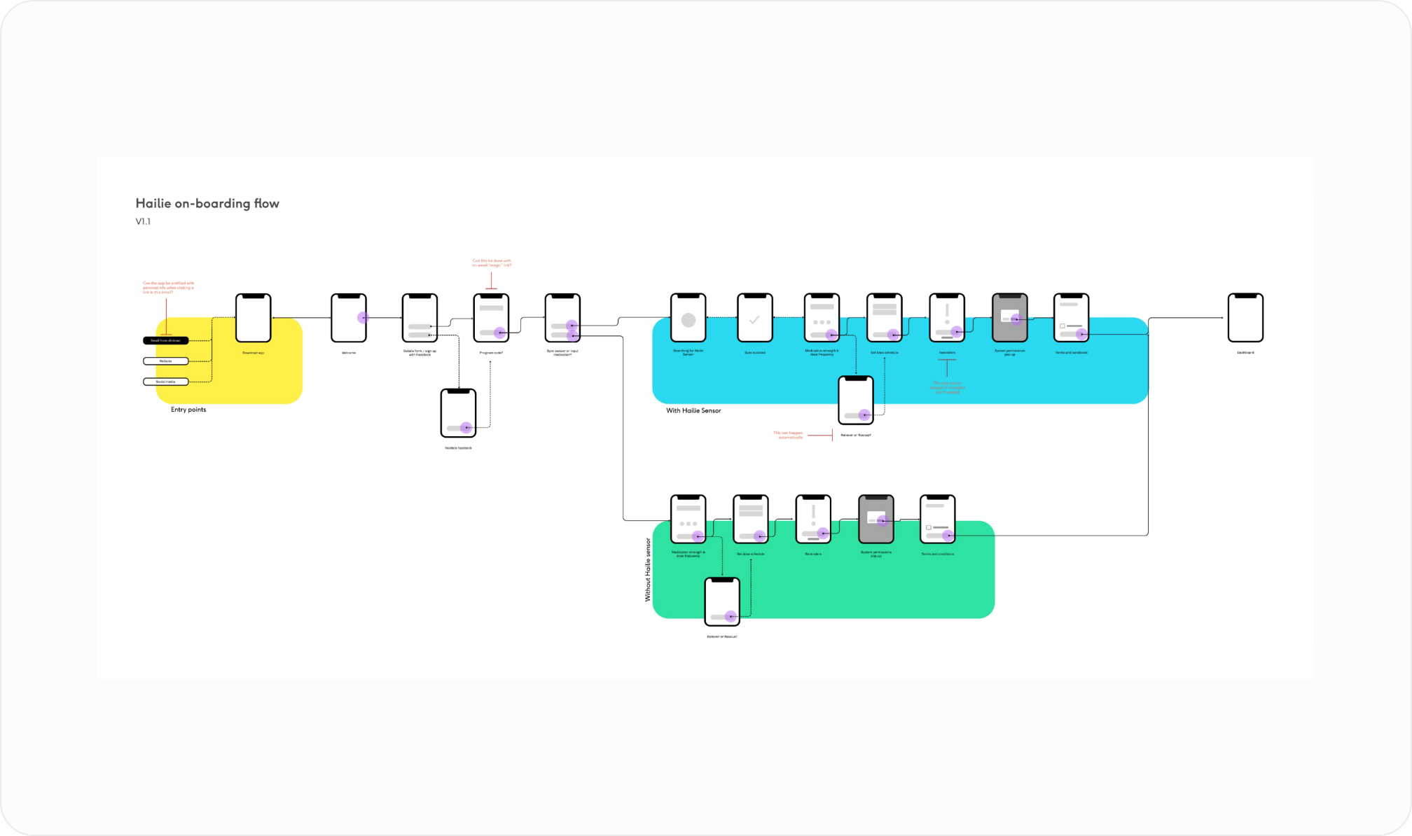
For Hailie, better onboarding wasn’t just a UX improvement — it was a business strategy. Helping people start strong meant higher retention, more engaged customers, and ultimately a better chance at success in a new market.
For me, it was a reminder that the first mile of the journey often decides the whole trip. Thoughtful onboarding can turn intention into habit — and in this case, help people breathe easier in more ways than one.
